Click to expand
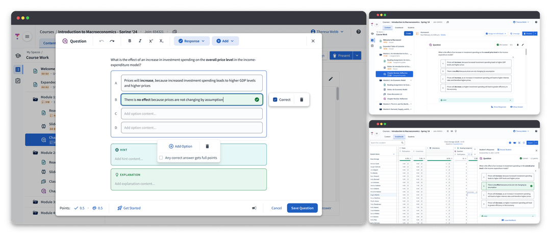
Redesigning the future of questions at Top Hat's to improve user experience, reduce technical debt, and unlock opportunities in STEM.

Click to expand
Top Hat is an EdTech company dedicated to empowering educators by facilitating engaging learning experiences. The app’s questions feature enables educators to connect with students, promote active learning, and rapidly adjust materials to meet student needs.
New features and content types were essential for instructors who are actively looking to drive real and new education outcomes. However, the existing question infrastructure had accumulated significant technical debt, making it difficult to innovate and maintain consistency across the platform. By the time I joined in September 2021 our team was facing three key issues...
Lack of a flexible, scalable foundation made repeat work the norm.
New feature work required 6+ months of dev time, 9+ months to create new question types.
Tech debt rendered QA process completely unsustainable.
The gradual degradation of questions led to a poor quality, inconsistent user experience.
Question offering began to lag behind competitors without the capacity to catch up.
The team was inundated with bugs, many could not be fixed.
Top Hat was missing valuable opportunities in STEM.
The existing foundation could not support the flexible question constructions STEM disciplines required.
This prevented transition of our national title offering to e-Texts.
I worked alongside Senior Design Manager Greg Rogers to lead the redesign. Our team hypothesized that by reworking the foundation of questions into a flexible, scalable system...
Analyzing customer feedback and working closely with our internal Textbook Authoring team via biweekly brainstorming meetings allowed us to workshop initial design concepts and helped to inform the scope and design for our MVP.
Before diving into designs, I pulled together an in-depth audit of the existing questions framework. We found that existing question forms were inconsistent with no universal components causing questions to render differently across the app.

Click to expand
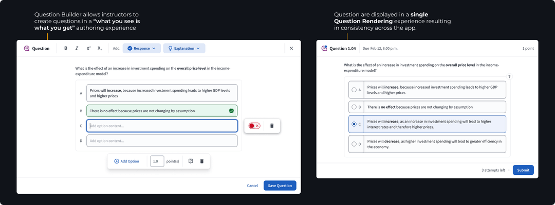
Through our investigation we determined that the lifecycle of a question in Top Hat could be distilled into two main sections: authoring & rendering.
We set out to create a single experience for each section, a universal Question Builder where educators could craft questions in a "what you see is what you get" style editor, and a Question Renderer consisting of reusable components to display questions consistently across the app.
Click to expand
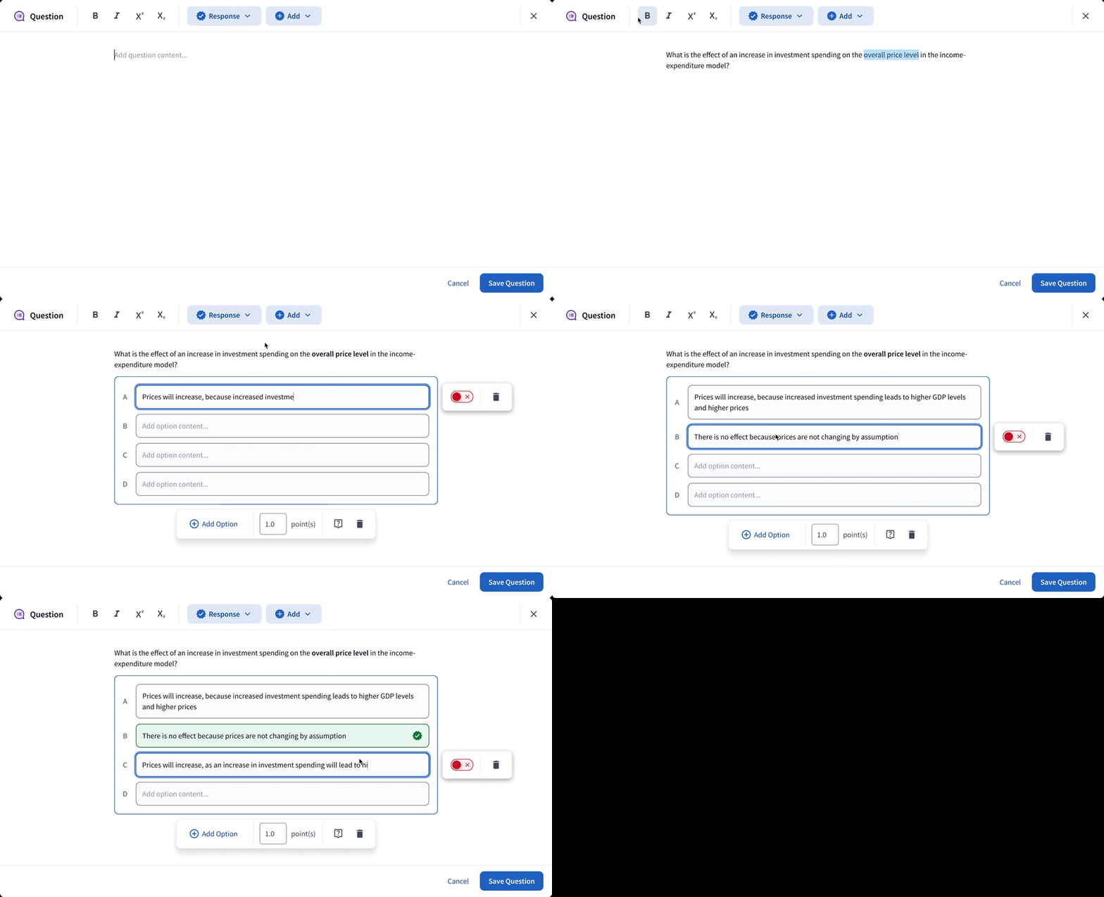
In order to support the kinds of expressive questions we needed, the Builder had to be flexible. Nothing like this existed in the market so we took inspiration from products like Notion and Confluence where a blank canvas, coupled with interchangeable blocks, allowed for endless customization.
This block-based editing system allowed us to leave behind the concept of distinct “question types” opting instead for response blocks that encapsulated functionality. Now, all questions could be created inside a single editor, simplifying the process to add new “question types”. We extended the block idea to features like images; allowing for placement anywhere within a question construction.
In the new foundation, any feature added to the universal Question Builder would automatically be available for any question construction, seamlessly integrated across the entire platform, ensuring consistency and scalability.
Click to expand
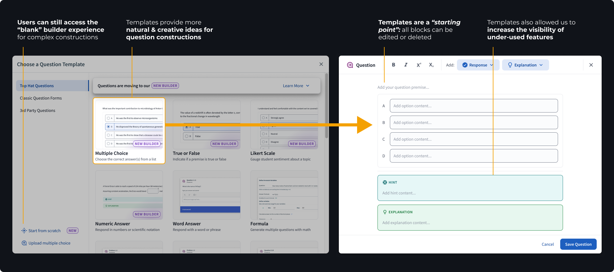
While flexibility was ideal for STEM, what we quickly realized through user testing was that users were overwhelmed by a completely blank canvas.
To bridge the gap, we introduced fully editable “templates” which could be dropped onto the canvas to provide a guide while maintaining the Builder’s flexible nature.
Click to expand
Once a question was authored, the job of our Question Renderer was to create a consistent question experience from this point on.
The Renderer was designed as a single component comprised of multiple smaller systems that work together to react to the question’s context and present the relevant information. This ensured questions looked great and worked smoothly anywhere in the app.

Click to expand
Our team knew the Question Builder was a novel concept. We were taking a risk in our assumption that the Builder would meet the needs of users creating both complex and simple question constructions.
To de-risk our assumptions we decided to conduct a usability study. Through this research we hoped to:
Check out the full Question Builder UXR Summary.
Click to expand
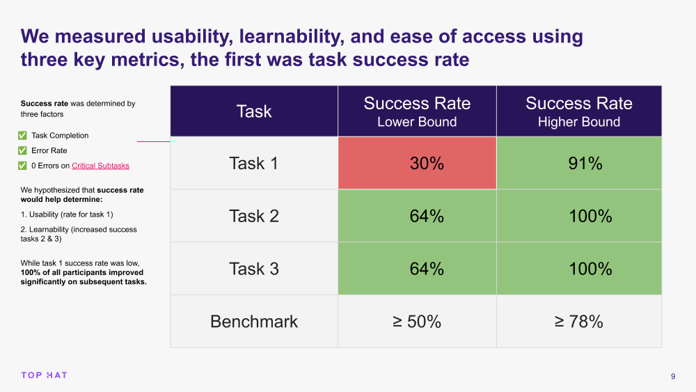
The data told us that once users got it, they got it. Question creation speed and success increased drastically across the board on the second attempt.
Unfortunately, the learning curve was too steep and would likely prevent a users from returning outside of a structured study. We needed to find away to help users learn the builder more quickly.
By analyzing the data we honed in on three strong signals telling us what tripped participants up during the initial experience.
83% of users could not find or understand the correctness toggle
67% of users wanted us to bring back the old correctness checkbox
50% of users wanted us to “just show” the correctness toggle
83% of users were looking for more feedback and guidance to learn how to use the builder
67% of users were confused by the lack of a label on the numeric input
67% of users were unclear what would be in the numeric advanced menu (cog icon)
We immediately began ideating and iterating on these key areas. We prioritized updates to the correctness toggle and added a new onboarding experience to help first-time users understand how to use the feature.

Click to expand
Few things are worse than giant, bloated design files. Greg and I were adamant from the start that, regardless of the projects length and complexity, drowning in dense documentation and clunky files would not be our fate.
Together, we crafted and implemented three strategies that were instrumental in maintaining quality and communication throughout the project.
Messy design explorations stayed in their own individual files. Once we agreed on a design decision we added it to our main file via a new branch and archived the exploration file.
We maintained one main spec file using pages to separate each new feature. We wrote specs as needed and deleted them using branches once completed.
This kept most written documentation out of our spec files and avoided duplicate work for PMs who would normally translate specs into tickets. It also gave us control over visual requirements and expectations.
If a ticket contained any visual or UX changes it had to go into Design Review before moving to done. This improved quality, reduced time running team QA, and allowed design to provide timely feedback to devs.

Click to expand
While the project is still ongoing we’ve already had some major wins, both internally and externally.
As of March 2024, 70-90+% of all multiple choice and numeric questions are created with the new builder
The new Question Foundation has reduced dev time to create new question types by 67%, requiring only 2 months to add the numeric question type
Our team was able to use the Question Renderer as a foundation to run rapid experiments with AI generated questions
Note: as of March 2024, multiple choice and numeric questions are available with additional question types to come.
This project was made possible by all of the incredibly talented members, both past and present, of the Questions & Gradebook team.
Huge thank you to Greg Rogers for being a fantastic mentor and challenging me to think outside the box, to Product Managers Elia, Ana, and Adrian for fearlessly guiding our team, and to Rahul, Sean and all of the talented devs who always advocated for quality and accessibility. I could not have asked for better partners.